How a Company Defines Its Identity
Exploring the strategic process of logo creation, how design shapes brand identity and audience perception.

Project Brief
TIIR, a corporate entity dedicated to helping SMEs find the right investors, needed a strong visual identity reflecting its mission—Turning Ideas Into Reality. As their visual designer, I created a professional logo, business card, and letterhead that conveyed trust, innovation, and growth.
The logo symbolised transformation with modern typography and a balanced corporate colour palette to enhance credibility.
Project Name
TIIR Branding
Project Type
Logo Design
Subject Category
Freelance project to create a logo and a branding presence
Brand Essence
Who they are?
Before bringing the logo to life, it was essential
to dive into TIIR’s vision and understand the meaningful impact they aspired to create.
About Them
TIIR (Turning Ideas Into Reality) is a dedicated platform that bridges the gap between SMEs and experienced investors in the UAE.
By offering tailored funding opportunities, strategic mentorship, and access to valuable resources, TIIR fosters business growth and innovation.
Their goal is to create a collaborative ecosystem where ambitious entrepreneurs can transform their ideas into impactful ventures.

Their Mission
To empower UAE entrepreneurs and investors by providing a dynamic platform that facilitates capital flow and accelerates the growth of high-potential businesses, driving sustainable success and long-term impact.

Their Vision
To transform the UAE SME ecosystem by enabling dynamic, business-friendly capital access to strengthen the UAE economy while incubating ideas developed locally for global impact.
Their Brief
What do they want to convey?
The logo design aims to present TIIR as a unified, strong, and trustworthy brand — not as an acronym but as one cohesive identity.

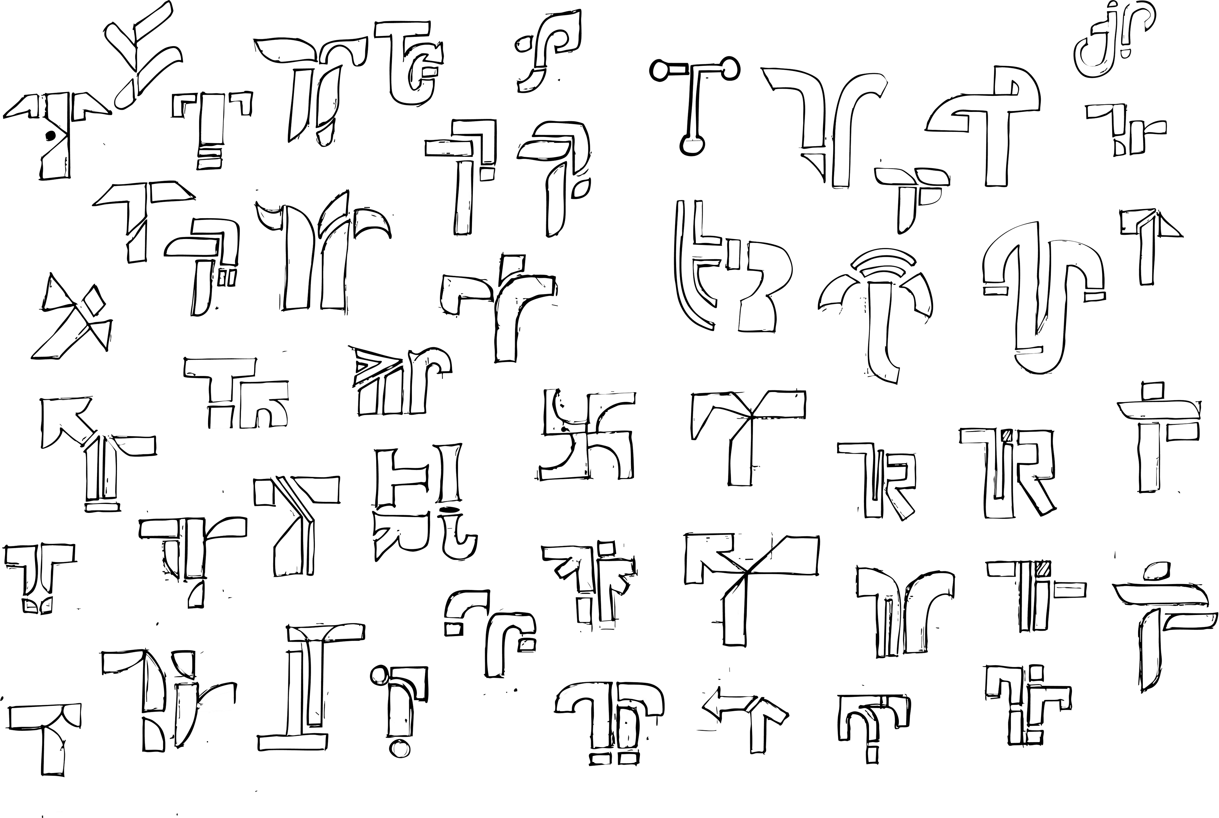
Ideations
process followed to create their identity
The design process began with studying competitors and gathering inspiration from various sources to understand what stands out. It shaped a unique direction for TIIR's visual identity.
Initial Ideation Sketches
Shortlisted Ideation Sketches

Brand Colour Palette
#092657
Accent Color
5%
10%
20%
30%
40%
50%
60%
70%
80%
90%
#FFFFFF
Neutral Color
#DFDFDF
Primary Color
#0E0E0E
Neutral Color
Typography
Aa
A B C D E F G H I J K L M N O P Q R S T U V W X Y Z
A B C D E F G H I J K L M N O P Q R S T U V W X Y Z
0 1 2 3 4 5 6 7 8 9
Font Name
RNS Physis
Font Use case
Primary Typeface: Headers, Subheadings
Aa
A B C D E F G H I J K L M N O P Q R S T U V W X Y Z
A B C D E F G H I J K L M N O P Q R S T U V W X Y Z
0 1 2 3 4 5 6 7 8 9
Font Name
Switzer
Font Use case
Secondary Typeface: Body Copy
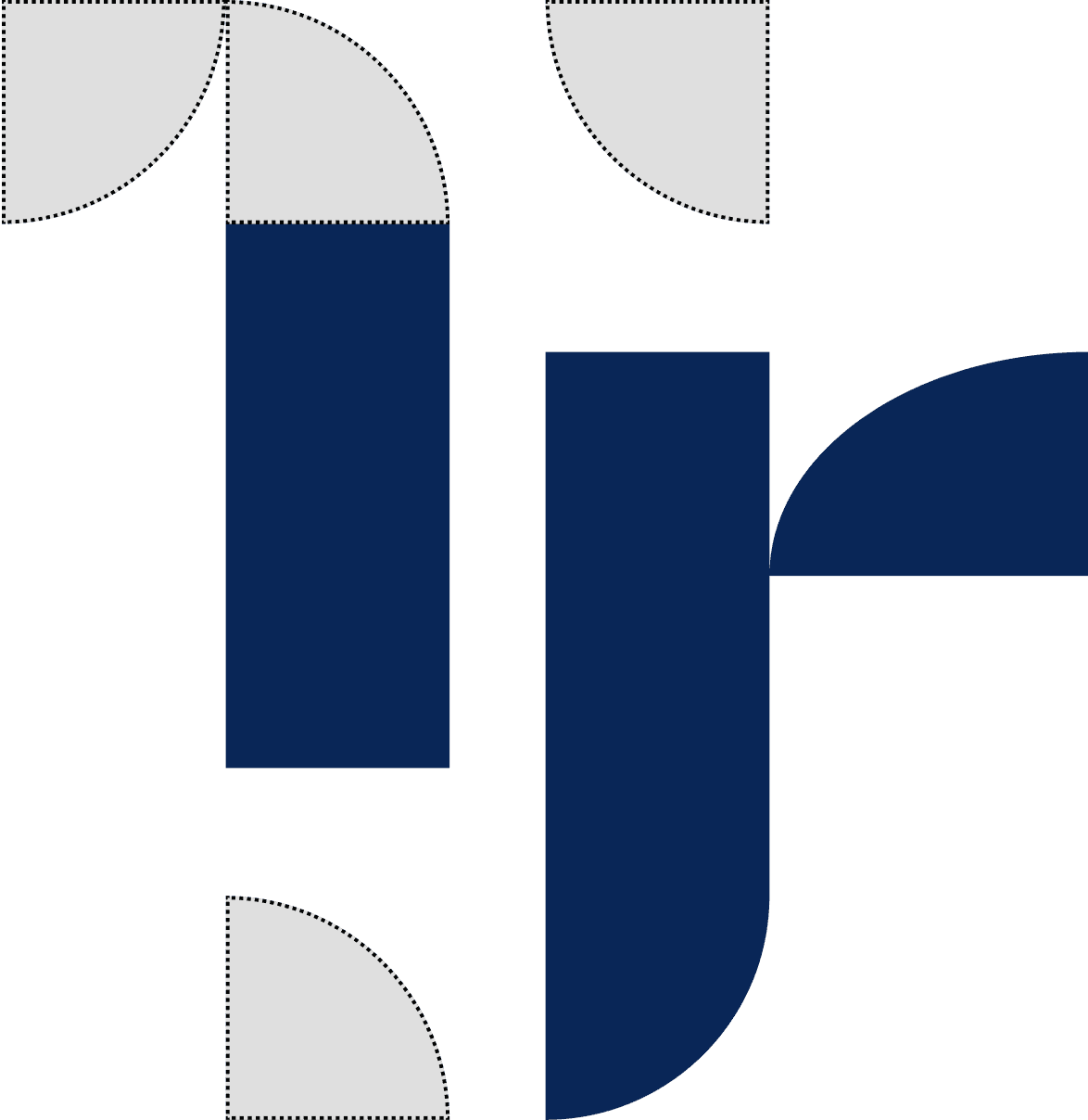
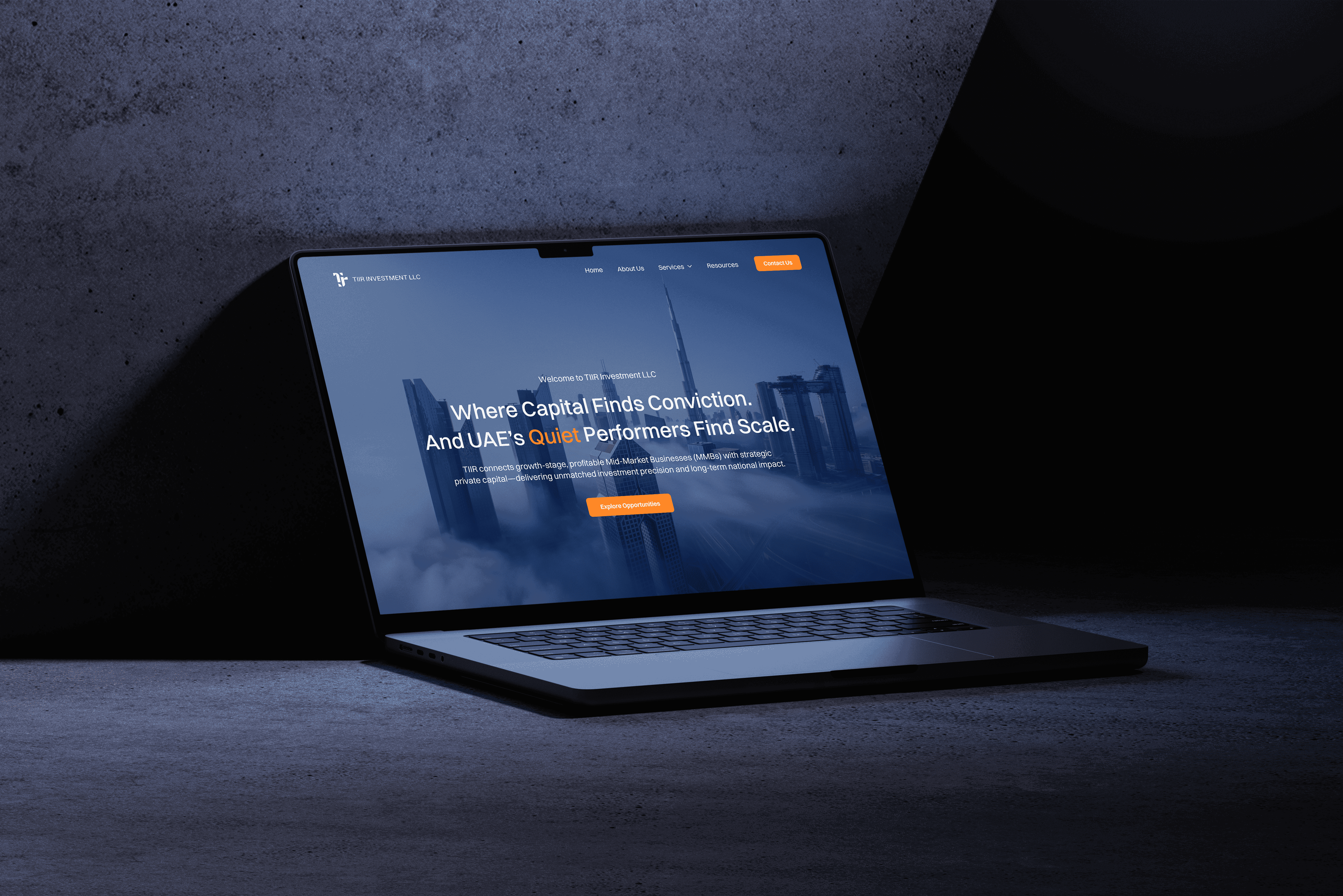
Introducing tiir LOGO

Logo Lockups


Logo Construction

It depicts all individual elements when put together to form a united whole.
Where the company is providing support to the SMEs to grow step by step together to achieve their goal.
Logo Guidelines

Developed a cohesive logo guidelines system to ensure consistent brand application. It defines visual rules that preserve brand clarity across digital and print touch points. Aimed at aligning internal and external brand communication.
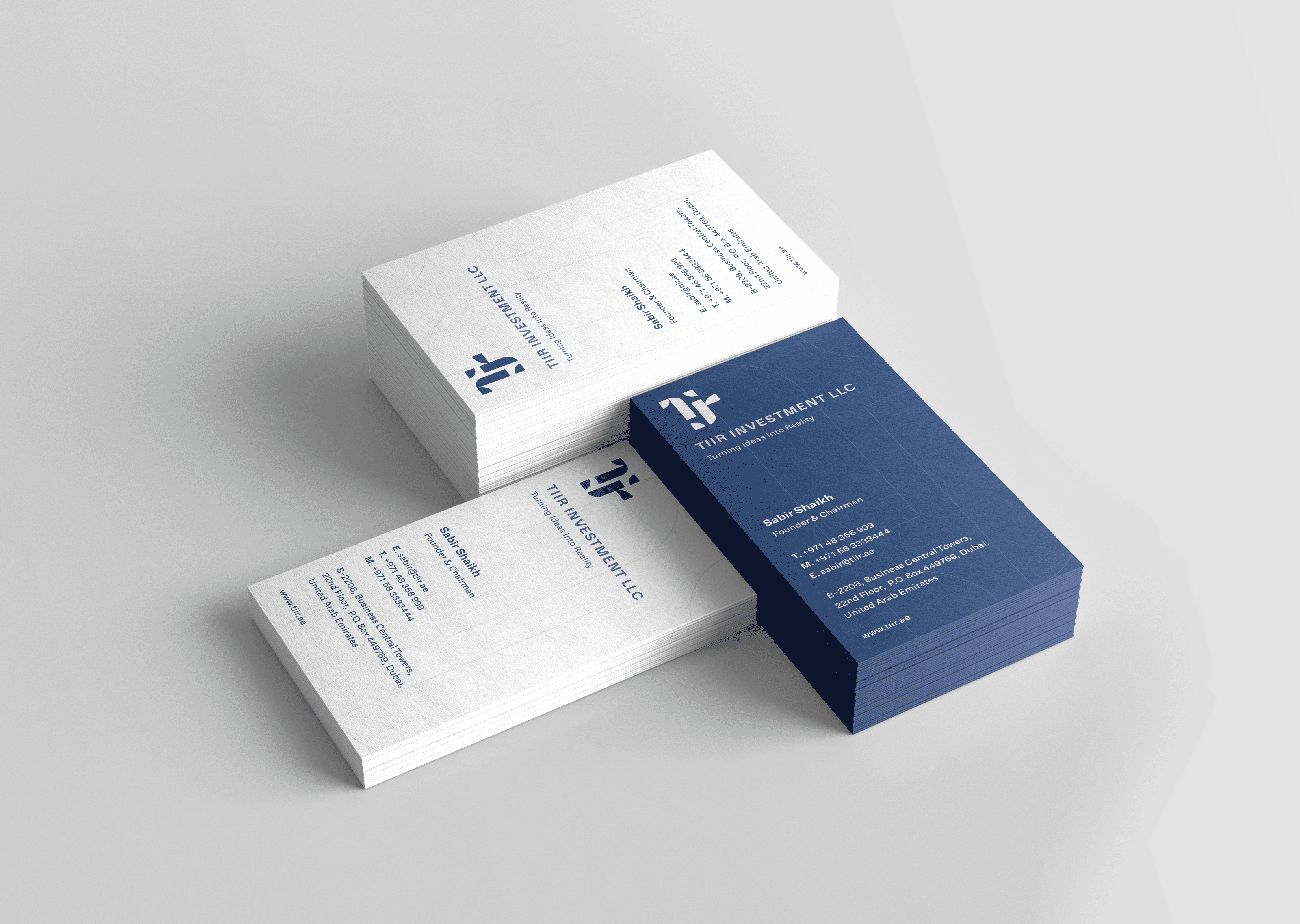
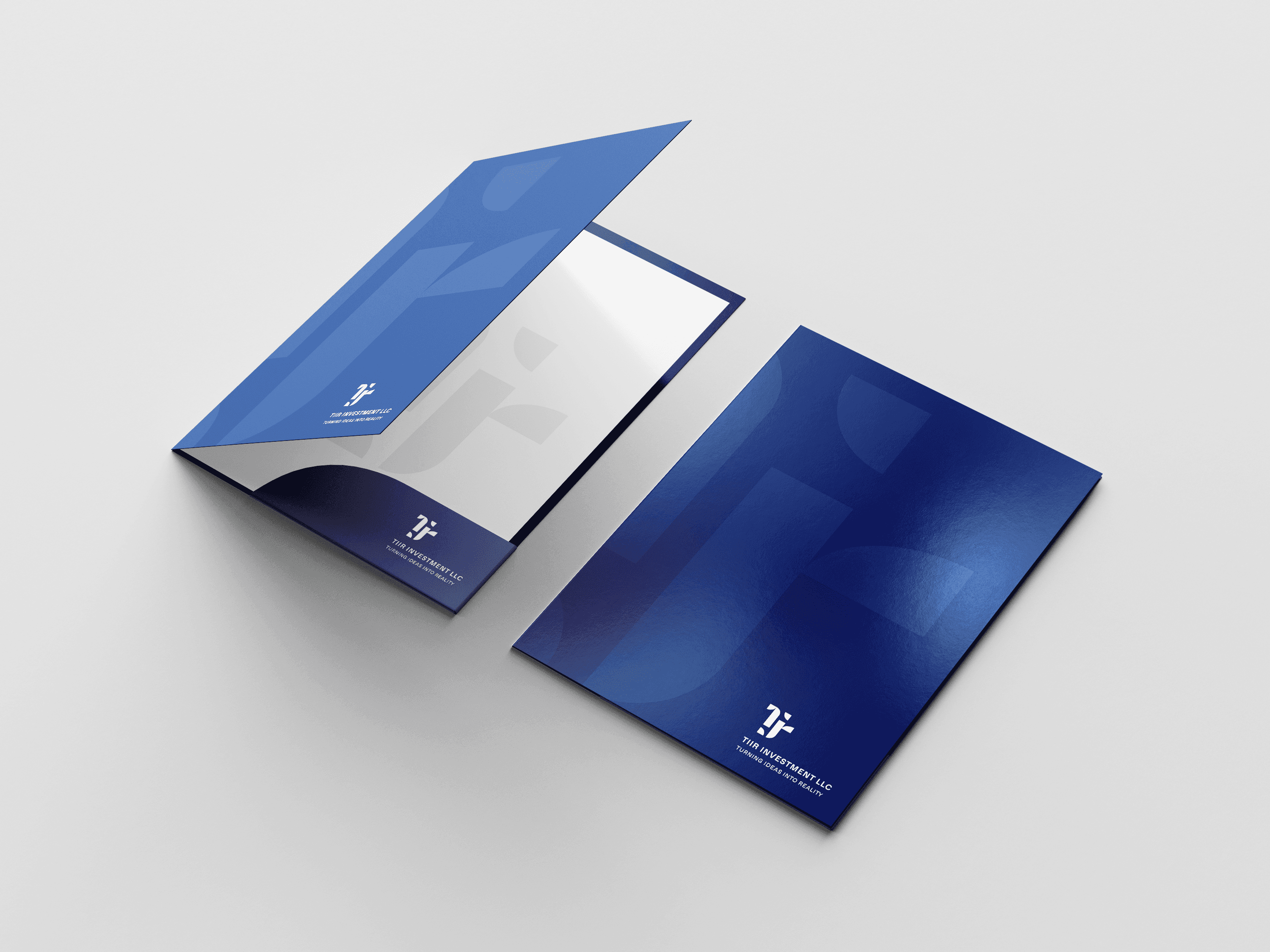
Logo Mockups


Key Learnings
What were my learnings through this project?
Joining TIIR after designing their brand identity gave me a deeper perspective on how design drives business impact.
Designing with Purpose
I learned the importance of aligning every design element with the brand’s core values and mission. For TIIR, understanding its role in innovation and growth helped shape a visual identity that communicates progress, trust, and professionalism.
Balancing Innovation with Simplicity
Crafting a long institutional name into a bold, minimal "TIIR" logo that is instantly recognisable was tricky. The design needed to be simple, memorable, and innovative — helping the brand stand out in a competitive space with just a quick glance. The iterative ideation and refinement process helped to derive an impactful outcome.
Building a Cohesive Identity System
Developing not just a logo, but a complete brand identity helped me understand how to maintain visual consistency across multiple touch points.
Toh ab chale
ek cup chai peene?
Mobile: +91 9867122350
Email: vrittidagliya04@gmail.com